How to Resize ProgressView in SwiftUI
Learn how to adjust the size of ProgressView in your SwiftUI app with these helpful tips and tricks

What is ProgressView?
ProgressView is a fundamental component in SwiftUI used to display the ongoing progress of a process, downloading state, or similar background tasks. It can be rendered in two primary styles: a determinate linear progress bar, which shows exactly how much of a task is completed, or an indeterminate circular activity indicator (often called a spinner), which simply communicates that the app is actively working. Properly utilizing a ProgressView significantly improves user experience by setting clear expectations during wait times.
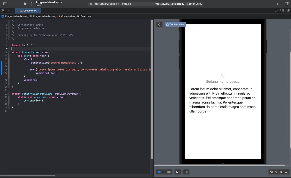
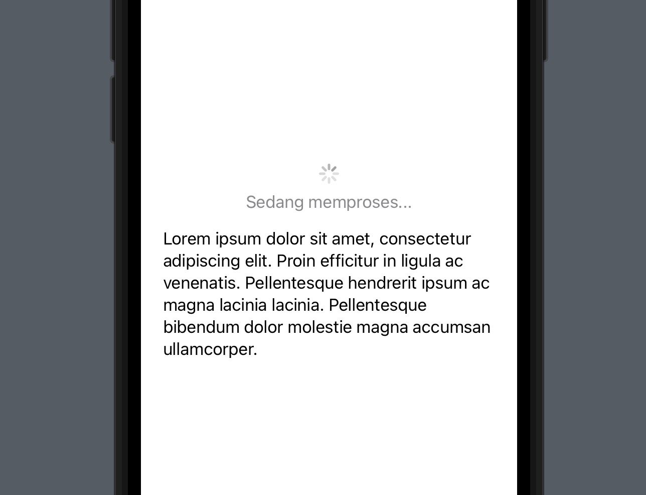
struct ProgressView<Label, CurrentValueLabel> where Label : View, CurrentValueLabel : ViewWhen developing for varied Apple platforms, however, you might notice that the default ProgressView dimensions are quite constrained. On larger displays like the iPad or macOS, or in designs where the loading state needs to be the primary focus of the screen, the default size often appears entirely too small. It can easily go unnoticed by the user, leading to confusion, as demonstrated in the typical implementation footprint below.
import SwiftUI

struct ContentView: View {
    var body: some View {
        VStack {
            ProgressView("Sedang memproses...")

            Text("Lorem ipsum dolor sit amet, consectetur adipiscing elit. Proin efficitur in ligula ac venenatis. Pellentesque hendrerit ipsum ac magna lacinia lacinia. Pellentesque bibendum dolor molestie magna accumsan ullamcorper.")
                .padding(.top)
        }
        .padding()
    }
}
To overcome this design limitation, SwiftUI provides developers with a few straightforward and creative techniques to increase the size of a ProgressView. The most common methods include applying the standard scaleEffect modifier for basic upscaling, structurally separating the progress indicator from its accompanying text label to prevent typographical distortion, or leveraging native sizing modifiers if you are targeting newer platforms.
Resizing ProgressView using scaleEffect
If you are targeting older iOS versions prior to iOS 15, the most reliable and widely used method to change the size of your ProgressView is by applying the scaleEffect modifier. The scaleEffect(_ s: CGFloat, anchor: UnitPoint = .center) modifier applies a mathematical 2D scaling transformation to the view. By simply attaching this modifier and passing a multiplier value—such as 2.0 to double the size—the graphical progress indicator scales up instantly across the X and Y axes.
struct ContentView: View {
    var body: some View {
        VStack {
            // Apply scaleEffect to enlarge the ProgressView
            ProgressView("Sedang memproses...")
                .scaleEffect(2, anchor: .center)

            Text("Lorem ipsum dolor sit amet, consectetur adipiscing elit. Proin efficitur in ligula ac venenatis. Pellentesque hendrerit ipsum ac magna lacinia lacinia. Pellentesque bibendum dolor molestie magna accumsan ullamcorper.")
                .padding(.top)
        }
        .padding()
    }
}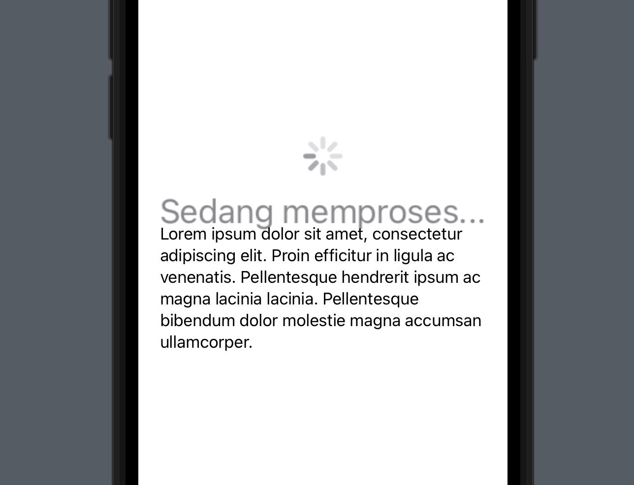
The Drawback of scaleEffect: While scaleEffect successfully enlarges the indicator, it comes with a significant visual drawback. Because this modifier acts as a graphical zoom for the entire view hierarchy within the component, it uniformly scales both the circular spinner and its associated descriptive text label. This unintended scaling produces a disproportionately massive and often blurry font rendering, ruining the typographic hierarchy of your user interface. Therefore, an alternative and much cleaner solution is to enlarge only the graphical progress indicator without mathematically affecting the label.
Separating the label from ProgressView
To achieve a well-proportioned design, developers should decouple the text label from the ProgressView component entirely. Instead of passing a string into the ProgressView initializer, you can instantiate an empty ProgressView, apply the scaleEffect modifier exclusively to it, and then pair it side-by-side with an independent Text view cleanly wrapped inside a vertical or horizontal stack (VStack or HStack).
struct ContentView: View {
    var body: some View {
        VStack {
            // Empty ProgressView scaled independently
            ProgressView()
                .scaleEffect(2, anchor: .center)
                .padding()

            // Standalone Text view for the label
            Text("Sedang memproses...")
                .foregroundColor(.secondary)
                .font(.headline)

            Text("Lorem ipsum dolor sit amet, consectetur adipiscing elit. Proin efficitur in ligula ac venenatis. Pellentesque hendrerit ipsum ac magna lacinia lacinia. Pellentesque bibendum dolor molestie magna accumsan ullamcorper.")
                .padding(.top)
        }
        .padding()
    }
}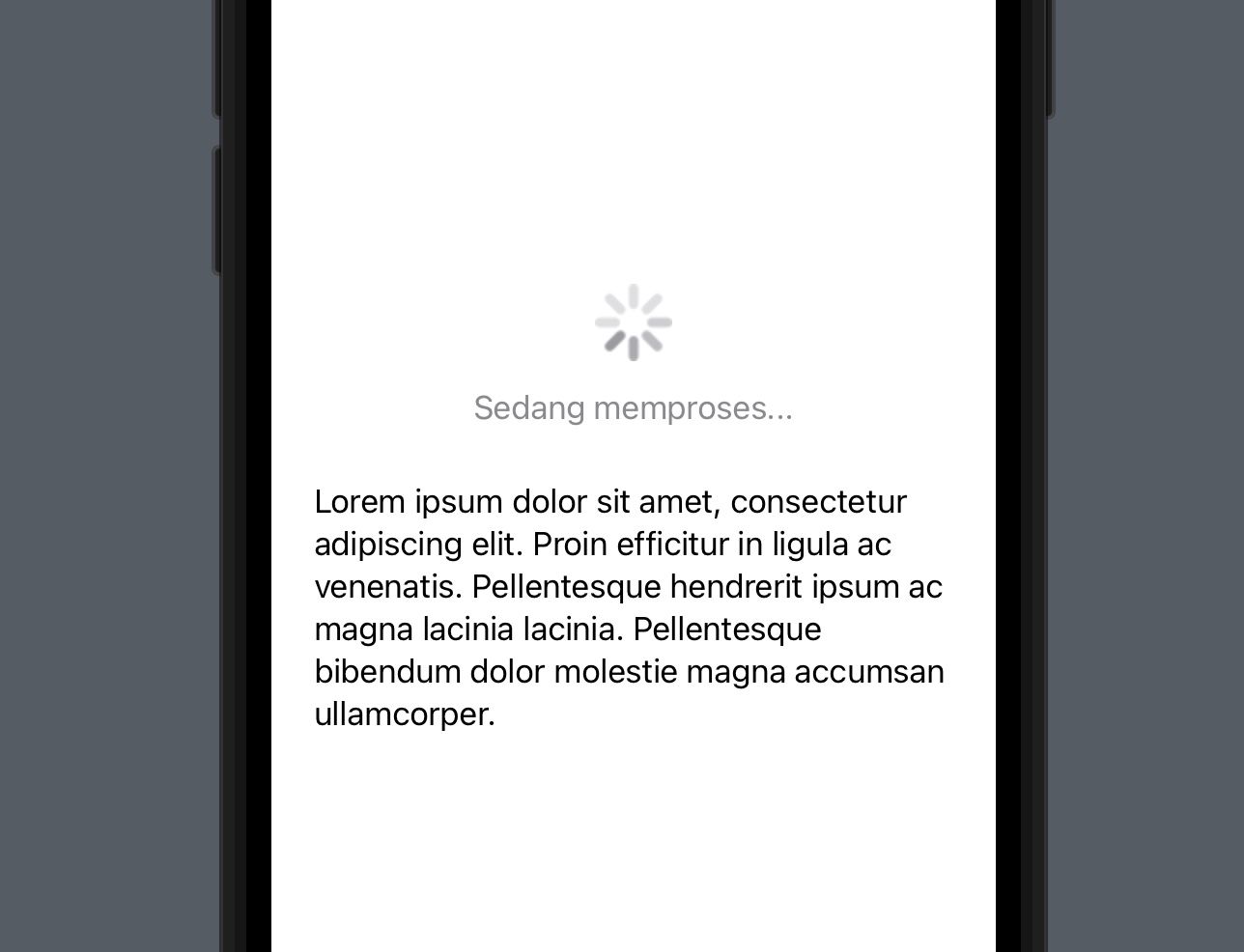
By separating the two elements, you regain complete control over the typography of your loading label. The spinner is correctly enlarged, while your Text view retains its crisp, high-resolution rendering and standard font weight. This method is the safest route when building for backward compatibility under iOS 15.
Using controlSize (iOS 15+)
For modern applications targeting iOS 15 or later, Apple has introduced a much more elegant, declarative, and robust solution: the controlSize modifier. Integrated directly into SwiftUI's control styling architecture, controlSize is a dedicated semantic modifier used to natively adjust the intrinsic rendering footprint of various UI components, including the ProgressView, without relying on hacky scaling workarounds.
nonisolated func controlSize(_ controlSize: ControlSize) -> some ViewThe controlSize modifier seamlessly accepts several predefined intrinsic sizes natively supported by the operating system. The available size parameters are .mini, .small, .regular (which is the system default rendering size), and .large. Furthermore, starting with the release of iOS 17 and macOS Sonoma, Apple expanded this API to include a massive .extraLarge option, which is perfect for full-screen loading overlays, splash screens, or prominent empty states.
import SwiftUI

struct ContentView: View {
    var body: some View {
        VStack(spacing: 20) {
            ProgressView("Processing...(large)")
                .controlSize(.large)

            ProgressView("Processing...(regular)")
                // Default size, explicit modifier is optional

            ProgressView("Processing...(mini)")
                .controlSize(.mini)

            Text("Lorem ipsum dolor sit amet, consectetur adipiscing elit. Proin efficitur in ligula ac venenatis. Pellentesque hendrerit ipsum ac magna lacinia lacinia. Pellentesque bibendum dolor molestie magna accumsan ullamcorper.")
                .padding(.top)
        }
        .padding()
    }
}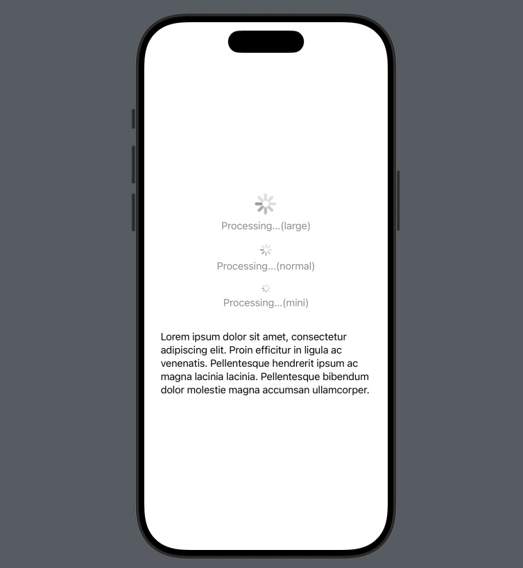
Advantages of controlSize: The absolute primary advantage of utilizing the controlSize modifier is that it explicitly commands the UI framework to redraw the progress indicator at a higher resolution natively, completely independent of the text label constraint. The circular spinner scales up sharply, while the accompanying descriptor label remains beautifully crisp at standard system font sizes. It thoroughly eliminates the blurry and mismatched typography issues of scaleEffect. The only minor downside is that developers are strictly limited to Apple's predefined semantic constants, preventing arbitrary sizing like 3.5x scaling.
Advanced: Custom ProgressViewStyle
If you find that even .extraLarge is not sufficient for your needs, or you want to fundamentally change how the progress is displayed (for example, creating a massive, custom-branded loading ring), you should consider adopting the ProgressViewStyle protocol to build a completely custom graphical spinner from scratch using standard SwiftUI shapes and animations.
Conclusion
In conclusion, resizing a ProgressView in SwiftUI is a problem that requires different techniques depending on your deployment target. While the scaleEffect modifier is a versatile option for backwards compatibility, developers must be mindful of its impact on nested labels and the potential for graphical blurring caused by excessive scaling values. Structurally separating the text label from the spinner remains the safest workaround for older iOS versions, allowing the indicator graphic to grow while preserving pristine text crispness.