Creating Round Corners on Specific Corners of a View
Learn how to customize your SwiftUI views with specific rounded corners

The Limitation of Built-in cornerRadius
In SwiftUI, when you want to give a view rounded corners (like shaping a card or a generic container), the most common approach is to use the built-in .cornerRadius() modifier with a specified radius float value.
func cornerRadius(
    _ radius: CGFloat,
    antialiased: Bool = true
) -> some View
Here is a classic example of how to implement the standard corner modifier on a simple view background:
struct ContentView: View {
    var body: some View {
        VStack {
            HStack {
                Spacer()
            }
            .frame(height: 80)
            .background(.red)
            .cornerRadius(50) // Applies to ALL 4 corners
        }
        .padding(30)
    }
}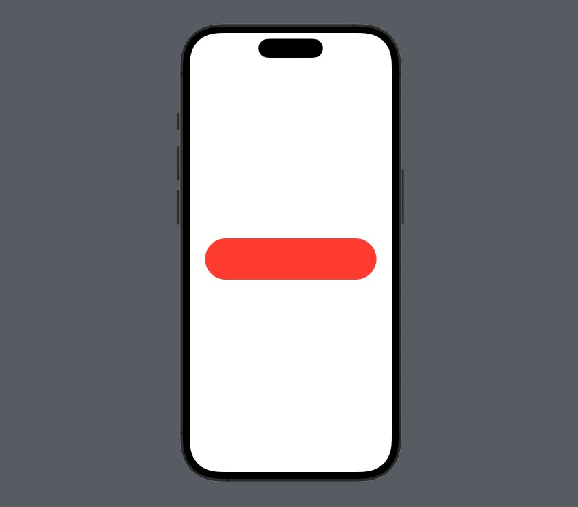
This works wonderfully for uniform interfaces. However, using the standard cornerRadius modifier natively rounds all four edges uniformly, which may not always align with your UI/UX design. What if you're building a chat application where speech bubbles only have three rounded corners? Or perhaps a bottom sheet where only the top-left and top-right corners should be rounded? To achieve localized rounding in native SwiftUI (especially prior to iOS 16), you must craft a custom shape and harness operators like clipShape or background.
Creating a Custom Shape for Specific Corners
To surgically target specific corners, we first need to build a custom Swift Shape that bridges the gap between SwiftUI's modern rendering and the older, more granular UIBezierPath APIs available via UIKit. Let's create a reusable struct called RoundedShape:
struct RoundedShape: Shape {
var radius = CGFloat.infinity
var corners = UIRectCorner.allCorners
func path(in rect: CGRect) -> Path {
let path = UIBezierPath(
roundedRect: rect,
byRoundingCorners: corners,
cornerRadii: CGSize(width: radius, height: radius)
)
return Path(path.cgPath)
}
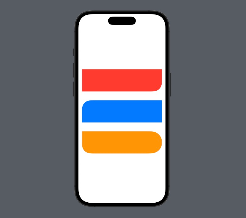
}This powerful custom component takes two configurable properties: radius and corners. The radius dictates the curvature intensity, while the corners property (which utilizes UIKit's UIRectCorner) acts as a bitmask to designate which corners receive the curvature. You can pass options like .topLeft, .topRight, .bottomLeft, .bottomRight, or even combine them continuously inside an array.
You can invoke this newly minted shape directly in your layouts:
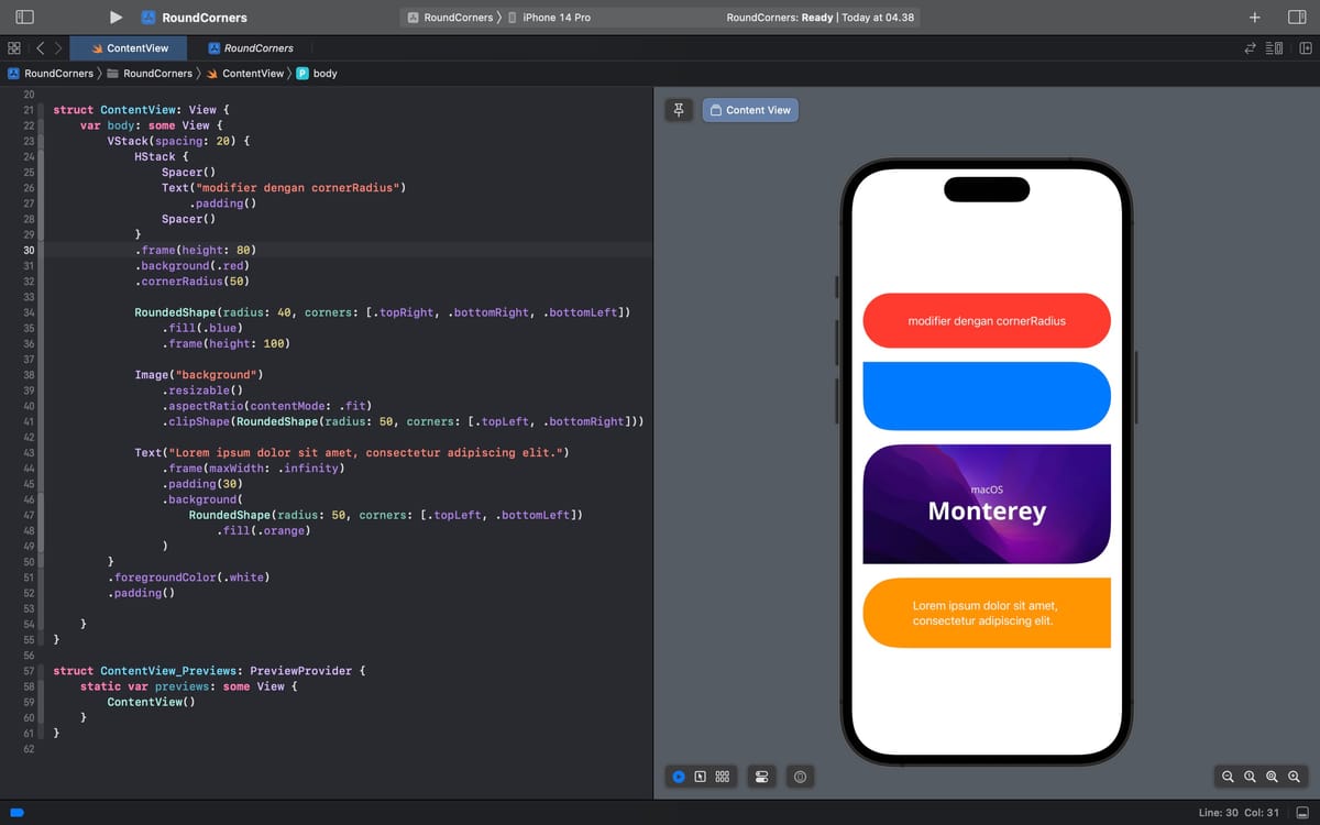
struct ContentView: View {
    var body: some View {
        VStack {
            RoundedShape(radius: 40, corners: .bottomRight)
                .fill(.red)
                .frame(height: 100)
                .padding()

            RoundedShape(radius: 40, corners: .topLeft)
                .fill(.blue)
                .frame(height: 100)
                .padding()

            // Combining multiple structural corners
            RoundedShape(radius: 40, corners: [
            	.topRight, .bottomRight, .bottomLeft
            ])
                .fill(.orange)
                .frame(height: 100)
                .padding()

        }
    }
}
Controlling Round Corners with clipShape
While drawing a standalone colored shape is nice, the ultimate goal is normally to format an existing piece of rich content (like an image or a button layout). You can wrap our custom geometry around an existing component using the .clipShape() modifier.
struct ContentView: View {
    var body: some View {
        VStack {
            Image("background") // Ensure this image is in your Assets
                .resizable()
                .aspectRatio(contentMode: .fit)
                .clipShape(
                	RoundedShape(
                    	radius: 50,
                        corners: [.topLeft, .bottomRight]
                    )
                )
        }
        .padding(30)
    }
}
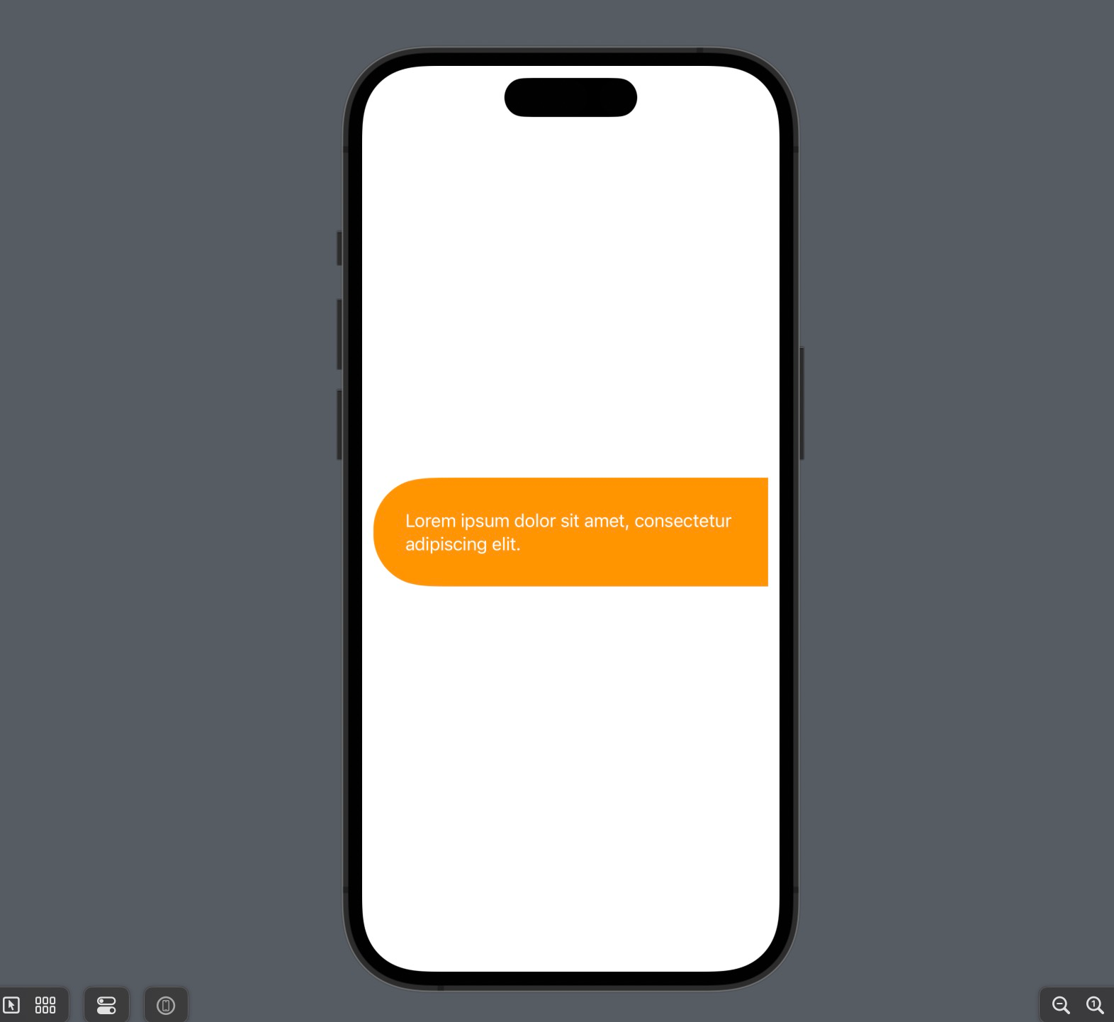
Controlling Round Corners with background
Alternatively, if your objective is to simply append a dynamically contoured colored backdrop to an implicitly transparent view—such as a piece of textual typography—you can inject it seamlessly through the .background() modifier.
struct ContentView: View {
    var body: some View {
        Text("Lorem ipsum dolor sit amet, consectetur adipiscing elit.")
            .foregroundColor(.white)
            .padding(30)
            .background(
                RoundedShape(
                	radius: 50, corners:
                    [.topLeft, .bottomLeft]
                )
                .fill(.orange) // Don't forget to explicitly fill the shape!
            )

    }
}
iOS 16 Update: UnevenRoundedRectangle
As a quick final tip, if your app's minimum deployment target is iOS 16 and above, Apple natively solved this widespread design requirement. You no longer strictly need to resort to UIKit bridges. You can instead leverage UnevenRoundedRectangle. That structural primitive directly accepts unique parameter configurations for each individual corner out-of-the-box. However, the legacy bridge method documented above remains indispensable for backward compatibility spanning iOS 13 through iOS 15.
Conclusion
Creating bespoke radii bindings across various edges vastly expands your design flexibility, permitting the execution of cards, stylistic tooltips, and asymmetrical banners. Hopefully, this step-by-step custom layout guide helps you perfect your future application aesthetics.
 meshwara