SwiftUI : Fixing the issue of an unclickable Plain Button when tapping on the empty area
This article discusses how to address the issue of Plain Buttons in SwiftUI that cannot be clicked in the empty areas

Understanding SwiftUI Button Hit-Testing
If you're using a Button widget in SwiftUI, you might assume that the tap area will seamlessly cover the size of the container you have defined. By default, when you construct a standard button without heavily modifying its core properties, the entire visual label (including padding and backgrounds) acts as a valid tappable area. This logic holds true as long as you rely on the standard styles provided by Apple, such as the .automatic or .bordered styles.
Let's look at an example of a standard button setup:
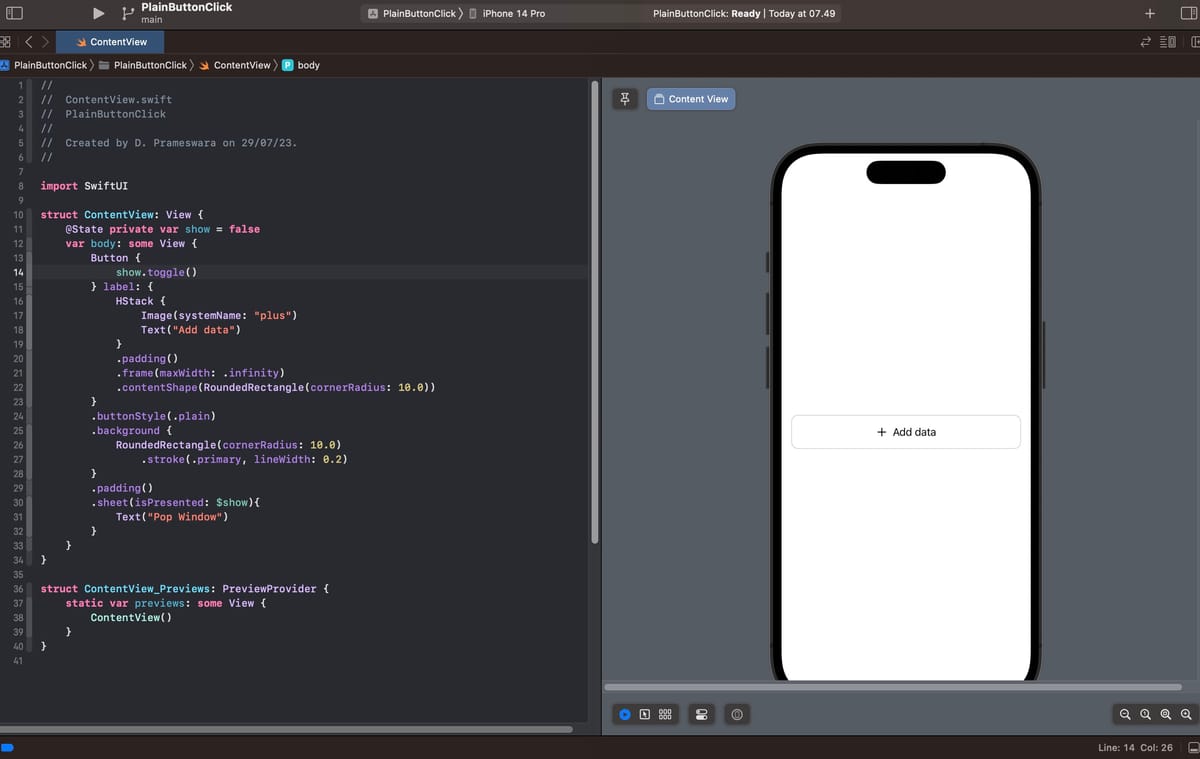
struct ContentView: View {
    @State private var show = false
    var body: some View {
        Button {
            show.toggle()
        } label: {
            HStack {
                Image(systemName: "plus")
                Text("Add data")
            }
            .padding()
            .frame(maxWidth: .infinity)
        }
        .background {
            RoundedRectangle(cornerRadius: 10.0)
                .stroke(.primary, lineWidth: 0.2)
        }
        .padding()
        .sheet(isPresented: $show){
            Text("Pop Window")
        }
    }
}
The example above features a Button containing an icon and text, encapsulated with an outlined border. According to our previous article regarding 5 ButtonStyles in SwiftUI, the default style applied structurally is automatic. As you can interact with it on a simulator or device, every part of the bounding box is clickable, even the transparent empty spaces.
The Problem with Plain Button Style
The default interactive behavior is excellent, but it comes with visual baggage. By default, iOS colors the content of standard buttons with the system accent color (usually blue), and when placed inside complex views like List, the entire row might exhibit flashing behaviors when tapped.
To neutralize the system styling, developers frequently inject the .buttonStyle(.plain) modifier. This approach forces the content inside the button to inherit its natural color (e.g., black or white text depending on Dark Mode), stripping away the default blue tint. This guarantees full aesthetic control over the button.
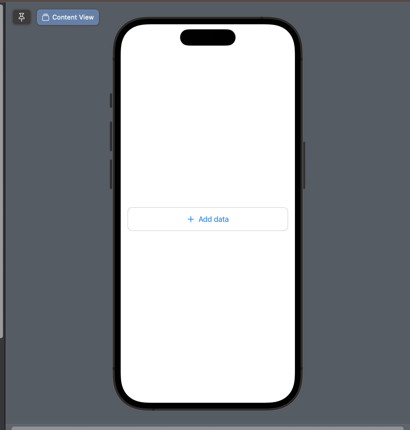
struct ContentView: View {
    @State private var show = false
    var body: some View {
        Button {
            show.toggle()
        } label: {
            HStack {
                Image(systemName: "plus")
                Text("Add data")
            }
            .padding()
            .frame(maxWidth: .infinity)
        }
        .buttonStyle(.plain) // Applying the Plain style
        .background {
            RoundedRectangle(cornerRadius: 10.0)
                .stroke(.primary, lineWidth: 0.2)
        }
        .padding()
        .sheet(isPresented: $show){
            Text("Pop Window")
        }
    }
}
However, this visually "perfect" solution introduces a nasty UX bug. By stripping the button style to .plain, you also inadvertently strip away the transparent hit-testing area. Suddenly, the button only reacts to taps that perfectly hit rendered pixels (like the text characters or the image strokes). Tapping the empty whitespace within the outlined bounding box does absolutely nothing.
The Solution: Using contentShape
Fortunately, SwiftUI provides a dedicated layout modifier specifically tailored for solving hit-testing shape problems: .contentShape(). This modifier instructs the rendering engine to calculate touch events against a specific geometric boundary, regardless of whether those pixels are transparent or visible.
// The contentShape modifier signature
func contentShape<S>(
    _ shape: S,
    eoFill: Bool = false
) -> some View where S : Shape
To fix the unclickable empty space, we just need to append .contentShape(Rectangle()) (or any other appropriate shape) directly into the view layout representing the Button's label. This guarantees that Apple's UI frameworks detect the tap across the entire defined geometry.
struct ContentView: View {
    @State private var show = false
    var body: some View {
        Button {
            show.toggle()
        } label: {
            HStack {
                Image(systemName: "plus")
                Text("Add data")
            }
            .padding()
            .frame(maxWidth: .infinity)
            // Fixes the hit-testing issue
            .contentShape(RoundedRectangle(cornerRadius: 10.0))
        }
        .buttonStyle(.plain)
        .background {
            RoundedRectangle(cornerRadius: 10.0)
                .stroke(.primary, lineWidth: 0.2)
        }
        .padding()
        .sheet(isPresented: $show){
            Text("Pop Window")
        }
    }
}
With this slight modification, the hit box is expanded to match the dimensions of the RoundedRectangle we specified natively. Now, taping the whitespace registers flawlessly as a button press.
Why This Happens Under the Hood
In iOS architecture, view elements do not automatically capture touch events in their transparent paddings unless explicitly instructed. Standard buttons have built-in system overrides that tell the OS: "Treat my padded background as a valid touch target." By switching to a plain style, you strip away those built-in behaviors, exposing the raw SwiftUI hit-testing logic which strictly relies on colored pixels.
Conclusion
The .contentShape modifier is a crucial tool in every SwiftUI developer's toolbox. It doesn't just fix plain buttons; it is also widely used to make whole List rows tap-able (for instance, when wrapping a complex view layout inside a NavigationLink), or when attempting to capture swipe gestures on transparent overlay views.
Happy experimenting, and I sincerely hope this little UI insight speeds up your development workflow!
 meshwara