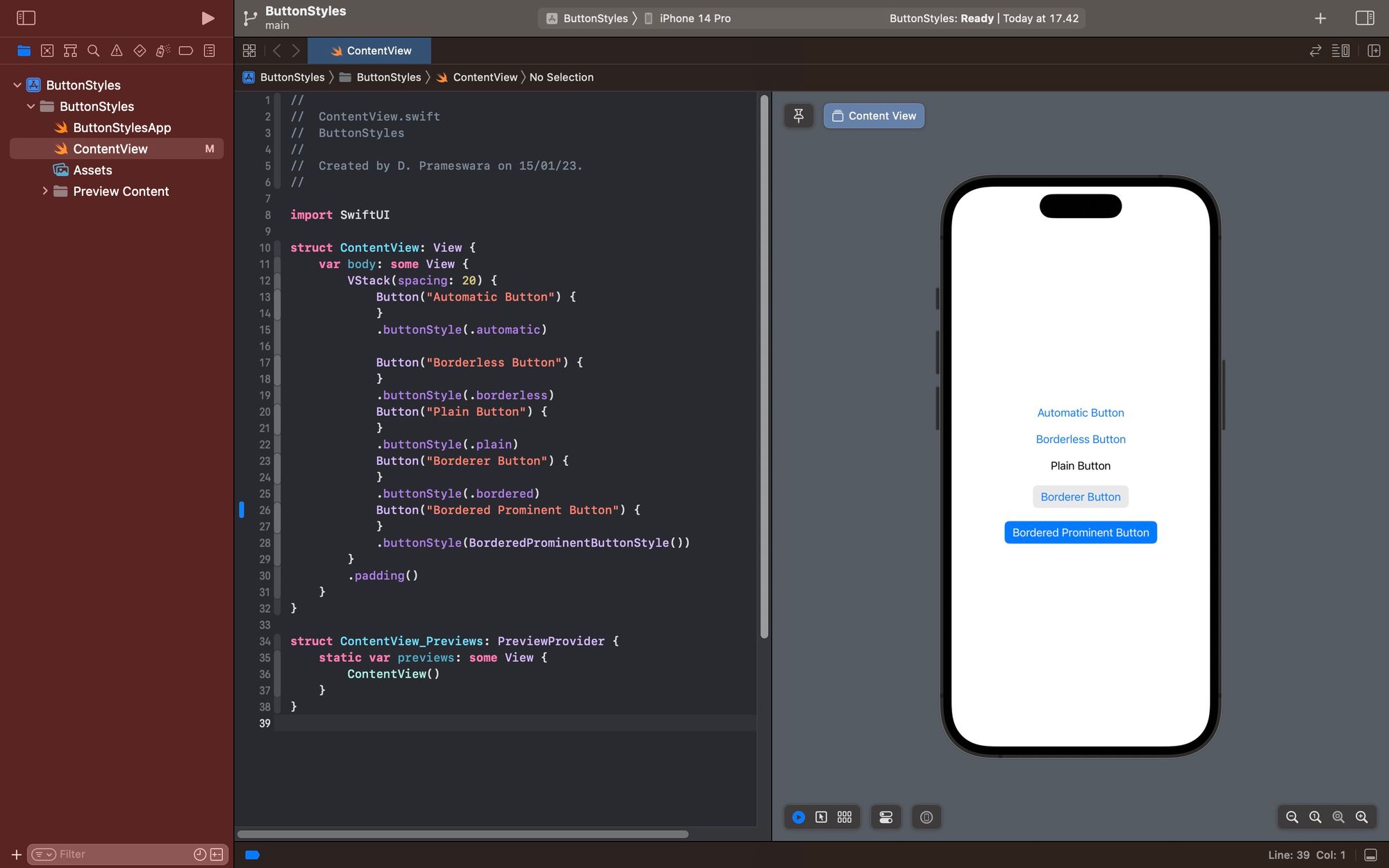
5 ButtonStyles in SwiftUI
This article discusses several button styles that can be used in SwiftUI

Button is one of the Views provided by SwiftUI by default and comes equipped with modifiers that make it easy to customize. You can adjust its size, color, and style. However, did you know that SwiftUI already provides 5 button styles by default that make it very easy to control the button's appearance?
The 5 default button styles provided by SwiftUI are as follows:
- Default/Automatic (.automatic)
- Borderless (.borderless)
- Plain (.plain)
- Bordered (.bordered)
- BorderedProminent (.borderedProminent)
To determine the style of the button you desire, simply add the buttonStyle modifier with one of the values mentioned above.
func buttonStyle<S>(_ style: S) -> some View where S : ButtonStyle#Default/Automatic
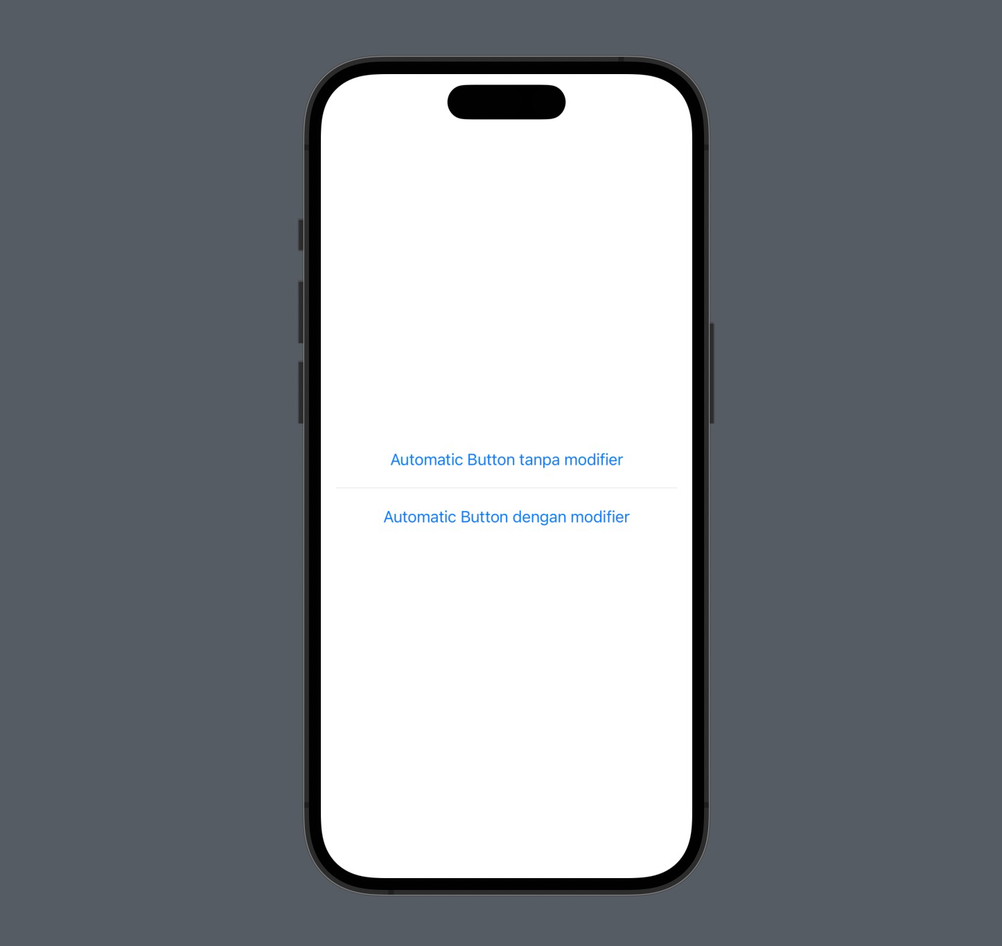
The default style is the style chosen by SwiftUI to display a Button if you don't configure anything. If you want to use this default appearance, you can simply add the buttonStyle modifier with the value .automatic."
struct ContentView: View {
    var body: some View {
        VStack(spacing: 20) {
            Button("Automatic Button tanpa modifier"){

            }

            Divider()

            Button("Automatic Button dengan modifier"){

            }
                .buttonStyle(.automatic)
        }
        .padding()
    }
}
#Borderless
The borderless style is a button style without borders. In fact, this is the button style that is displayed when you choose the buttonStyle modifier with the value .automatic. It's a simple style and is suitable for creating button appearances in HTML similar to anchors.
To use the borderless style, you can use the modifier with the value .borderless or BorderlessButtonStyle()."
struct ContentView: View {
    var body: some View {
        VStack(spacing: 20) {
            Button("Borderless Button"){

            }
                .buttonStyle(.borderless)

            Divider()

            Button("Borderless Button"){

            }
                .buttonStyle(BorderlessButtonStyle())


        }
        .padding()
    }
}
#Plain
The plain style is a borderless button style, but with a label color that matches the text. If the borderless style in HTML makes a button look like an anchor, plain style makes the button identical to the text but clickable.
To use the plain style, you can use the modifier with the value .plain or PlainButtonStyle().
struct ContentView: View {
    var body: some View {
        VStack(spacing: 20) {
            Button("Plain Button"){

            }
                .buttonStyle(.plain)

            Divider()

            Button("Plain Button"){

            }
                .buttonStyle(PlainButtonStyle())
        }
        .padding()
    }
}
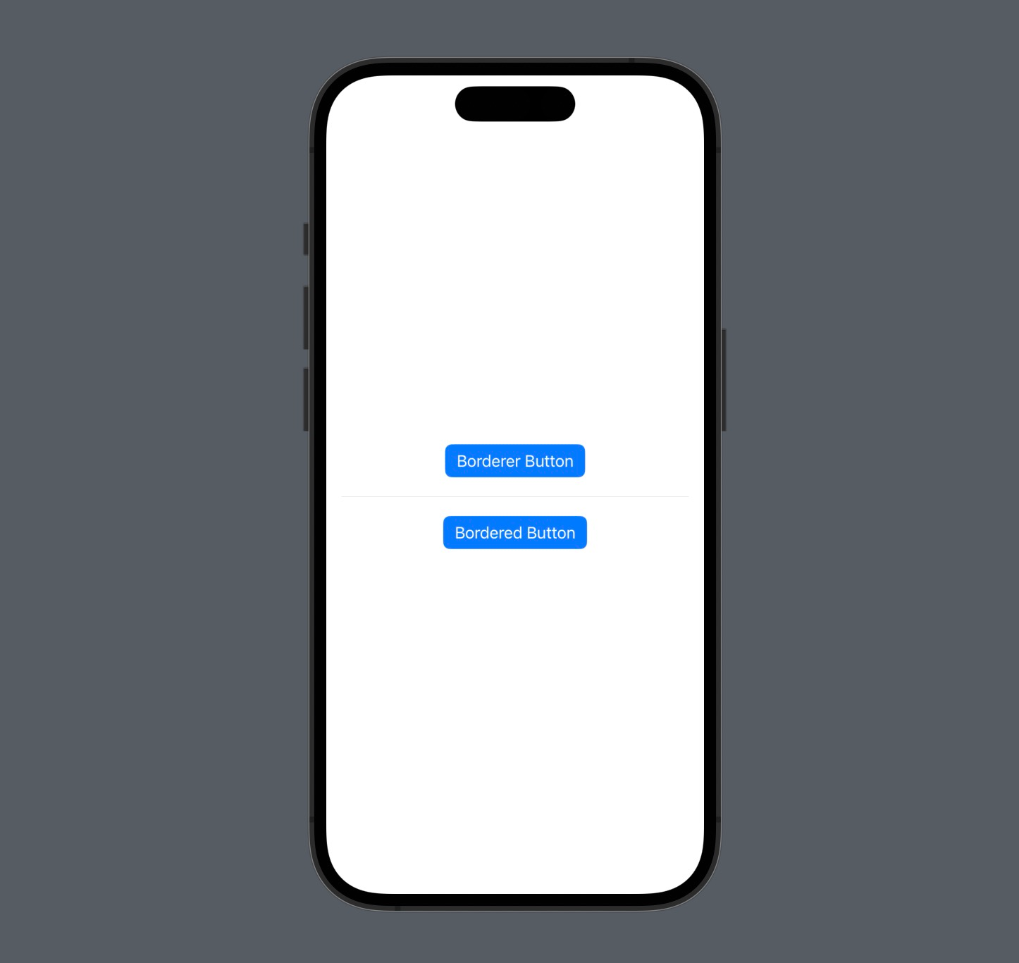
#Bordered
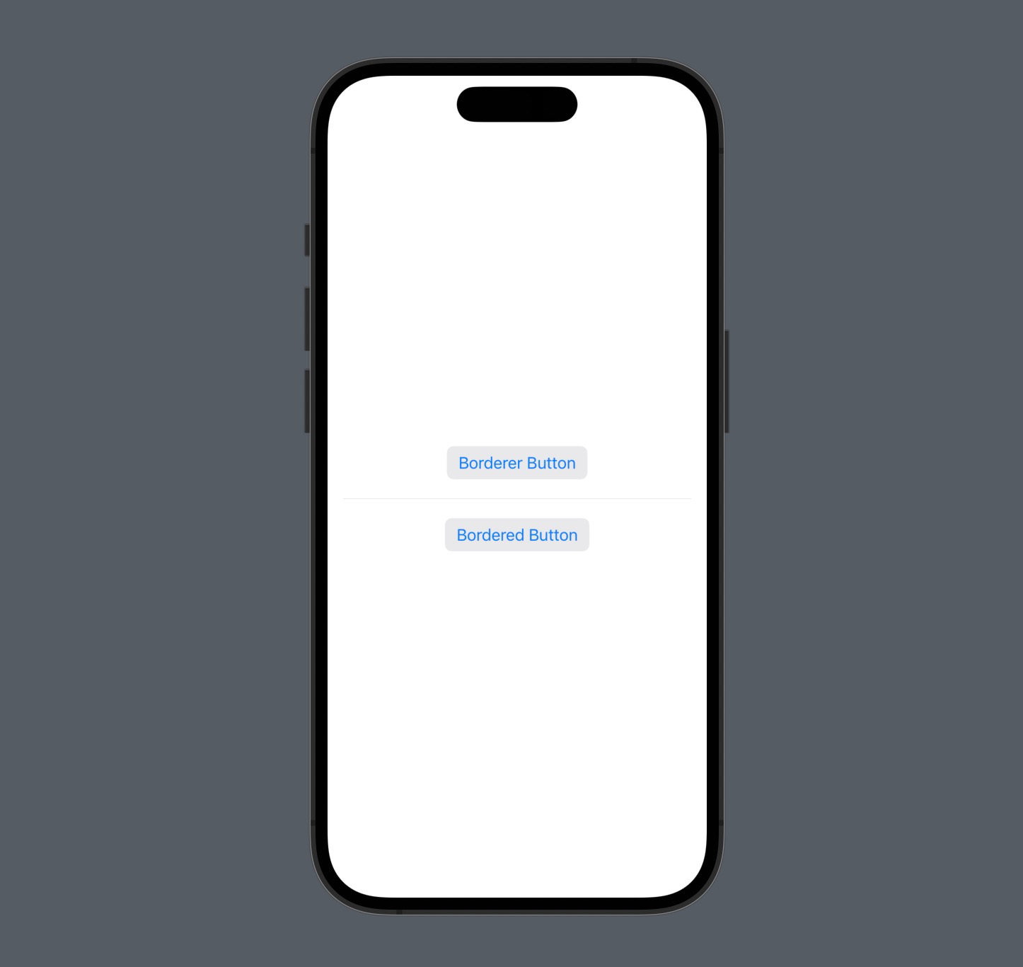
The bordered style is the opposite of borderless. With this style, the button will look like a typical button, with a background and border, but with a flat feel. If you want to make a button with this style, than use this modifier with the value .bordered or BorderedButtonStyle() .
struct ContentView: View {
    var body: some View {
        VStack(spacing: 20) {
            Button("Borderer Button"){

            }
                .buttonStyle(.bordered)

            Divider()

            Button("Bordered Button"){

            }
                .buttonStyle(BorderedButtonStyle())
        }
        .padding()
    }
}
#BorderedProminent
Bordered prominent is a style that displays a button like a commonly recognized button for users. It has a primary background and white text. If you want to make a button with this style, than use the modifier with the value .borderedProminent or BorderedProminentButtonStyle()
struct ContentView: View {
    var body: some View {
        VStack(spacing: 20) {
            Button("Borderer Button"){

            }
                .buttonStyle(.borderedProminent)

            Divider()

            Button("Bordered Button"){

            }
                .buttonStyle(BorderedProminentButtonStyle())
        }
        .padding()
    }
}
And here is an image of the buttons with each of the styles mentioned above.
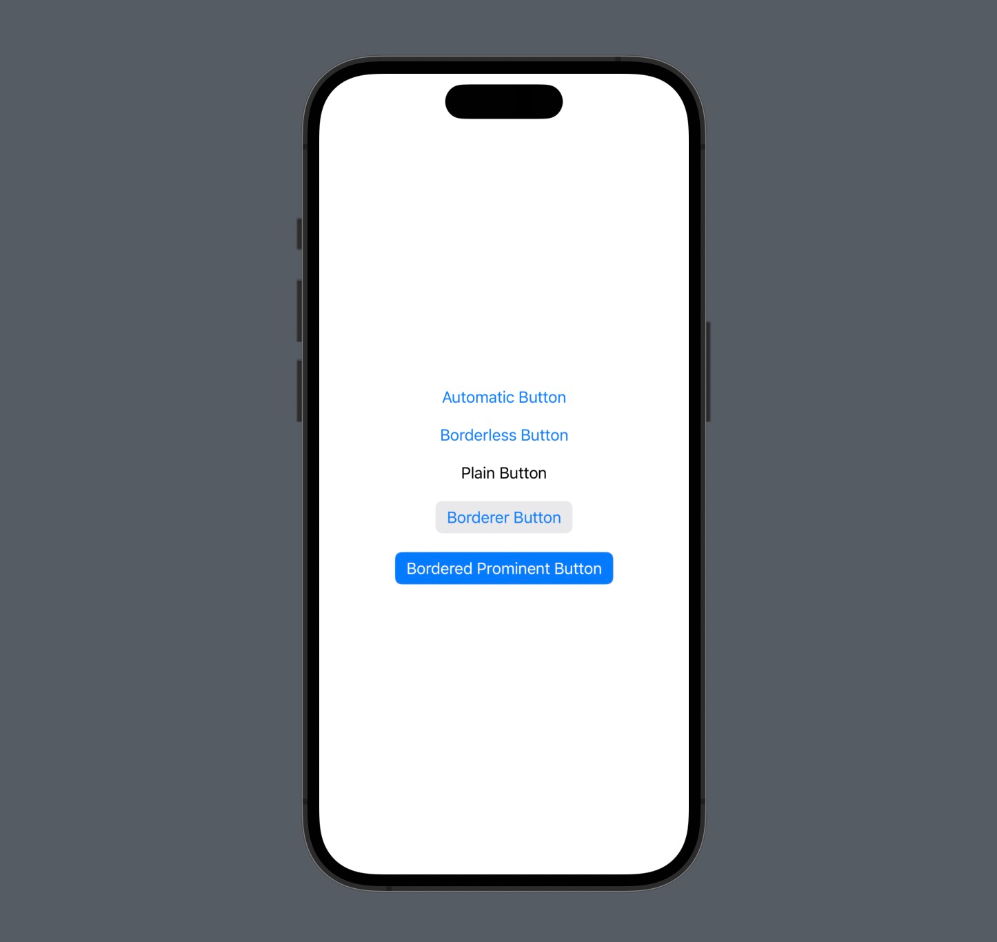
So, these are the 5 button styles that you can use to customize the appearance of a Button in SwiftUI. Feel free to choose the one that suits your needs
 meshwara
Good luck, and please trying them out, and I hope this little information is helpful.