Easy Way to Create a Floating Action Button (FAB) in SwiftUI
This article will discuss how to create a Floating Action Button using SwiftUI

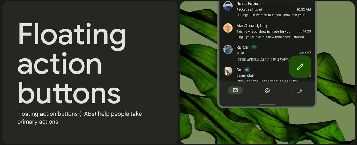
The Floating Action Button, or FAB, is a distinctive component of Android UI design known as Material Design. The FAB is a button or a set of buttons that float in the bottom right corner of a page. This button design is not standard for iOS, but in reality, many applications include Floating Action Buttons, and they are quite popular and useful.
In the following, we will try to create a Floating Action Button with SwiftUI. Currently, SwiftUI does not come with a native Floating Action Button widget/view, but we can still create it using a combination of ZStack and Button views.
#Mockup
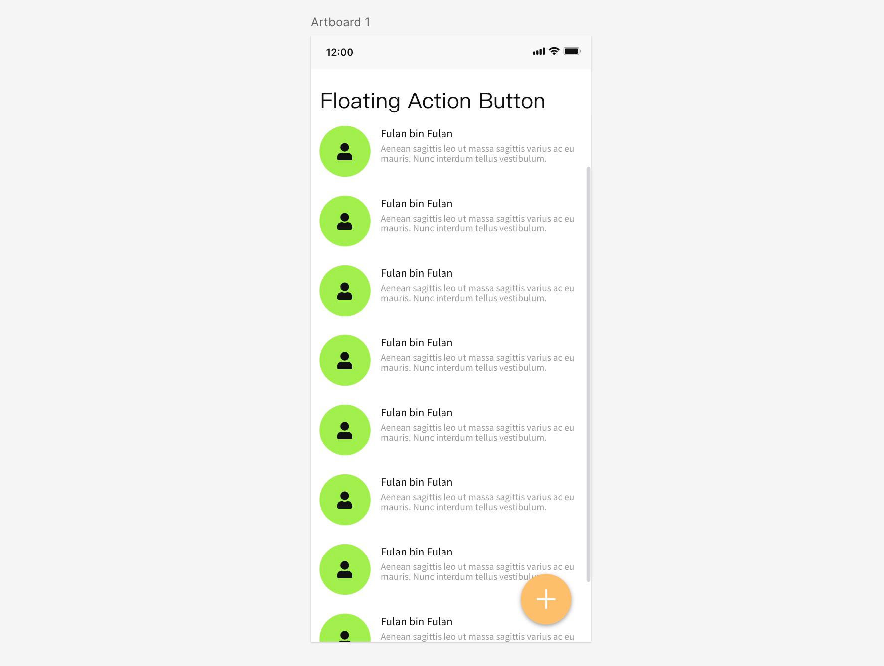
We will create a simple application with a layout that resembles the mockup below. A List with a FAB located in the bottom right corner. This layout is very common in Android applications, such as Gmail, Dropbox, and others.
#Creating a List
The first step is to create a page with a standard List as follows.
import SwiftUI

struct ContentView: View {
    var body: some View {
        List {
            ForEach(1 ... 30, id: \.self) { _ in
                HStack(spacing: 15) {
                    Image(systemName: "person.fill")
                        .padding(10)
                        .background(.green.opacity(0.3))
                        .clipShape(Circle())
                    VStack(alignment: .leading) {
                        Text("Fulan bin fulan")
                        Text("Aenean sagittis leo ut massa sagittis varius ac eu mauris. Nunc interdum tellus vestibulum bibendum pulvinar.")
                            .font(.caption)
                            .foregroundColor(.secondary)
                    }
                }
            }
        }
        .navigationTitle("Floating Action Button")
    }
}

#Adding ZStack and Button
Next is to add a button with a plus (+) icon in the bottom right corner. Therefore, we wrap the List in a ZStack and then add a Button.
struct ContentView: View {
    var body: some View {
        ZStack {
            List {
                ...
            }

            Button {
                //
            } label: {
                Image(systemName: "plus")
            }
            .padding()
        }
        .navigationTitle("Floating Action Button")
    }
}

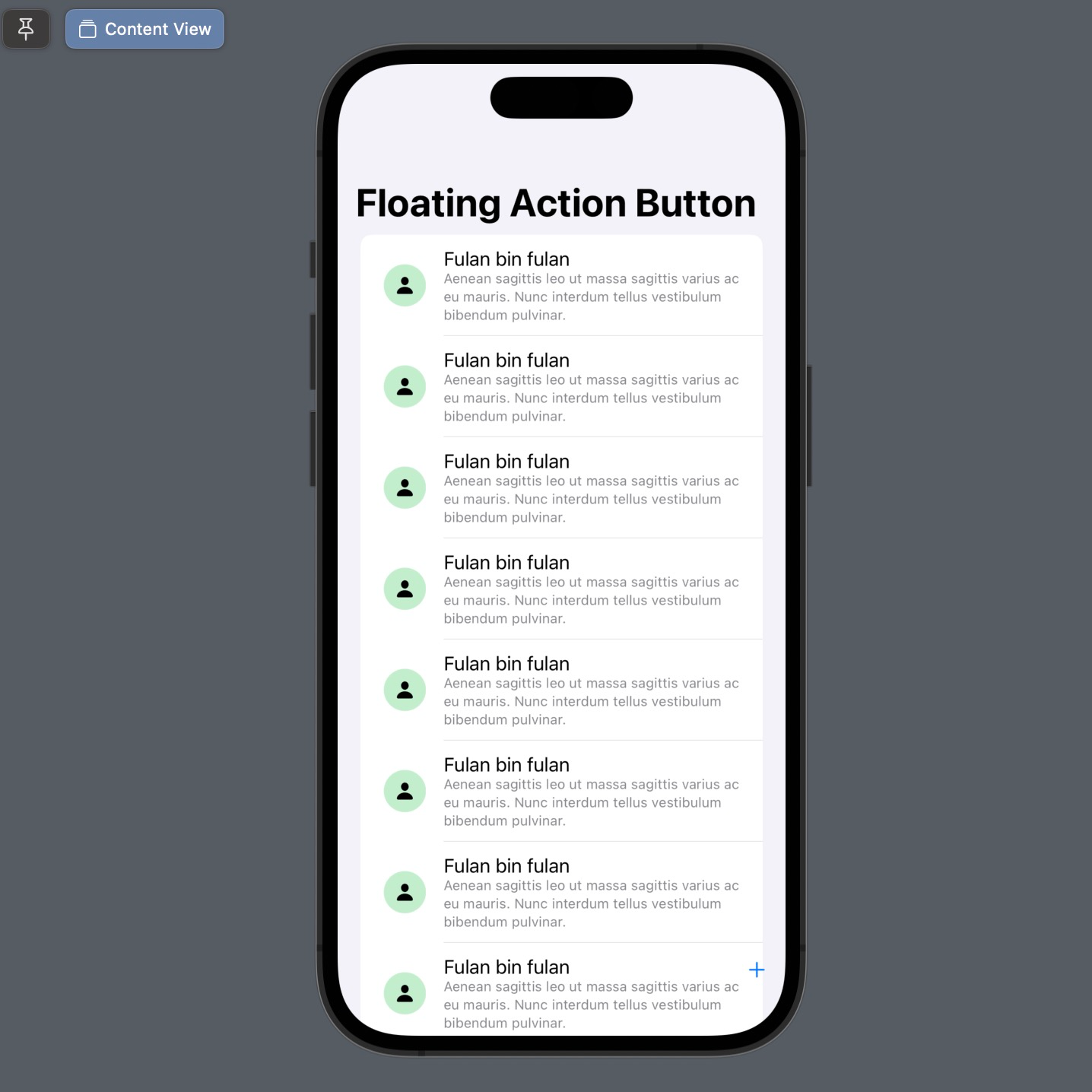
By default, ZStack will place all components in the center of the stack. Therefore, change the alignment of the ZStack to .bottomTrailing. Why bottomTrailing? Because the position of the button is in the bottom right corner. So, the position of the + button will move to the bottom right corner.
If you want to change the position of the FAB, please adjust the alignment value of this ZStack accordingly.
struct ContentView: View {
    var body: some View {
        ZStack(alignment: .bottomTrailing) {
            List {
               ...
            }

            Button {
                //
            } label: {
                Image(systemName: "plus")
            }
            .padding()
        }
        .navigationTitle("Floating Action Button")
    }
}
#Setting style for button
Next, let's adjust the style of the button to make it resemble the mockup, starting with a rounded background in orange color. In this case, the modifier is placed on the Image, not on the Button.
struct ContentView: View {
    var body: some View {
        ZStack(alignment: .bottomTrailing) {
            List {
                ...
            }

            Button {
                //
            } label: {
                Image(systemName: "plus")
                    .font(.title2.weight(.bold))
                    .foregroundColor(.white)
                    .padding()
                    .background(.orange)
                    .clipShape(Circle())
            }
            .padding()
        }
        .navigationTitle("Floating Action Button")
    }
}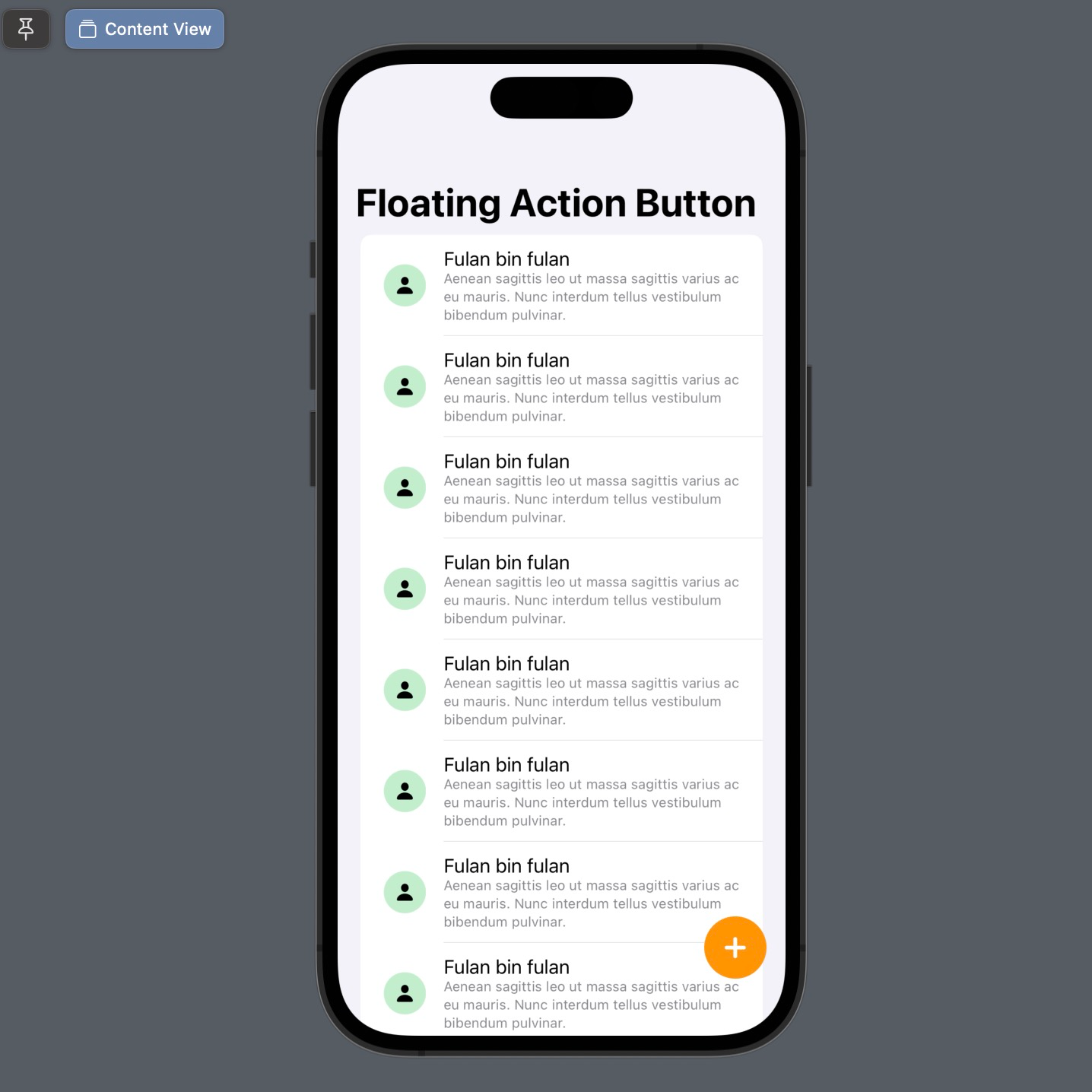
#Add drop shadow
To add a floating effect to the FAB, don't forget to add the .shadow modifier to the button.
struct ContentView: View {
    var body: some View {
        ZStack(alignment: .bottomTrailing) {
            List {
                ...
            }

            Button {
                //
            } label: {
                Image(systemName: "plus")
                    .font(.title2.weight(.bold))
                    .foregroundColor(.white)
                    .padding()
                    .background(.orange)
                    .clipShape(Circle())
                    .shadow(radius: 5, x: 0, y: 3)
            }
            .padding()
        }
        .navigationTitle("Floating Action Button")
    }
}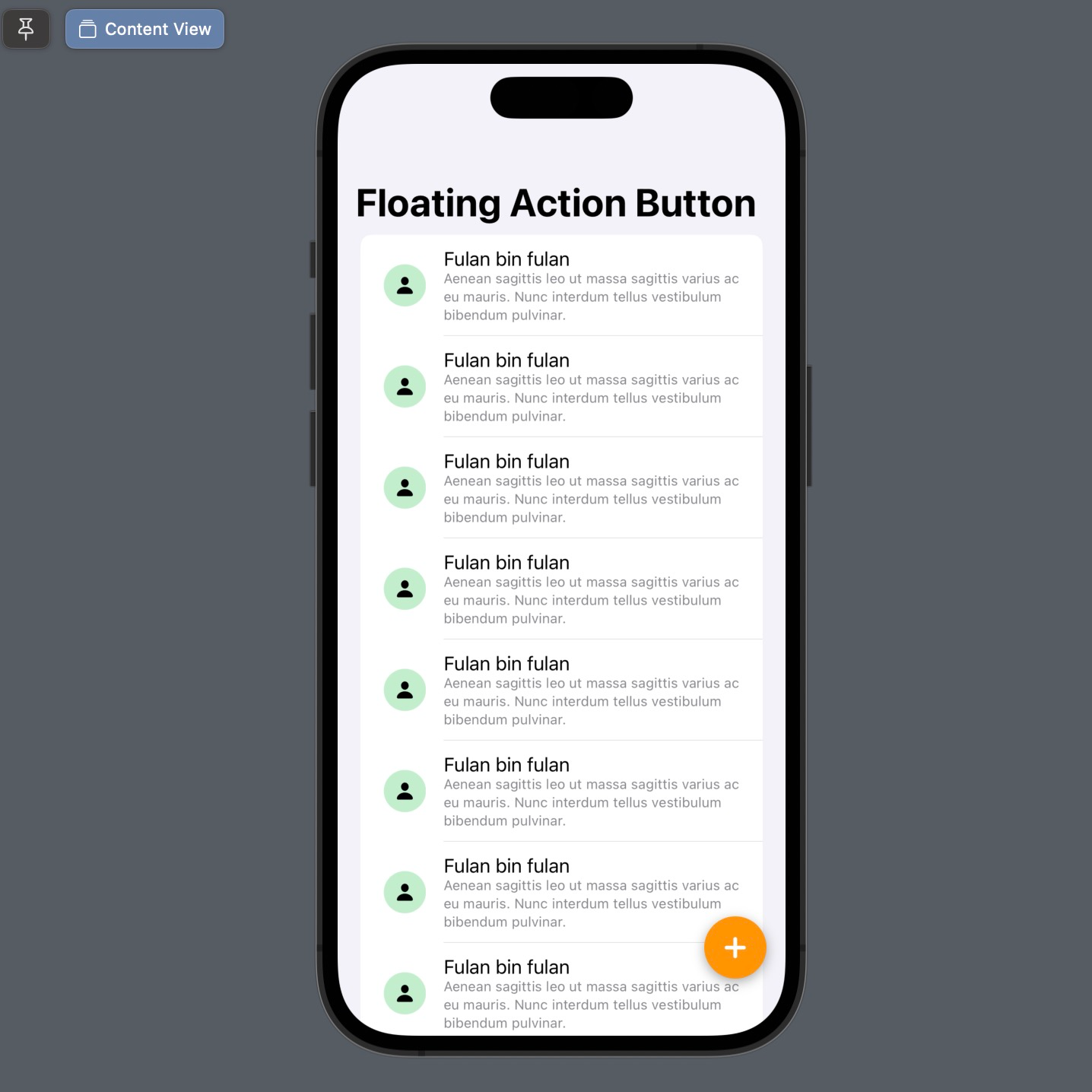
At this point, you have successfully created a Floating Action Button using SwiftUI. The result can be said to be almost identical to the FAB design for Material Design.
Floating action button in SwiftUI
Here are the tips/tricks for now, good luck trying them out, and hopefully, this little bit is helpful.
 meshwara