Easy Way to Create a Floating Action Button (FAB) in SwiftUI
This article will discuss how to create a Floating Action Button using SwiftUI

Understanding the Floating Action Button
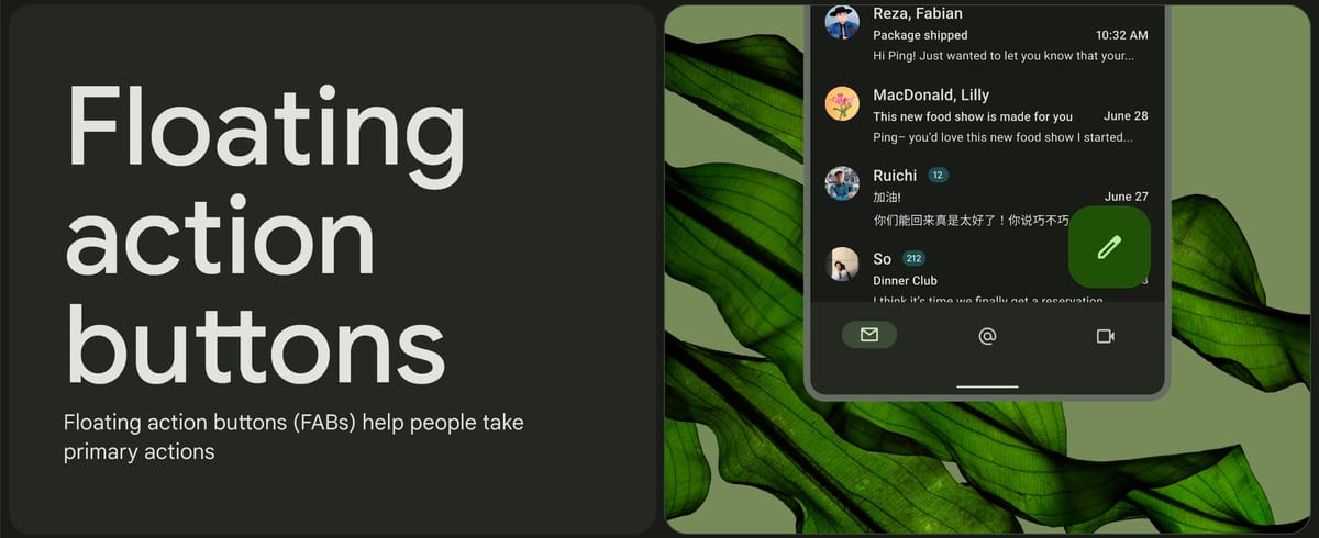
The Floating Action Button (often abbreviated as FAB) is a foundational and highly distinguishable UX component native to Google's Material Design language. A FAB is typically represented as a circular icon button that floats persistently above a page's foreground content, usually housed safely in the bottom-right corner. It is engineered to promote the primary, most common action users will take on that specific screen.
Although this design principle was born on Android platforms, modern user interfaces have heavily cross-pollinated. It's now incredibly common to encounter a Floating Action Button scattered across major iOS applications—like composing an email in Gmail, adding files in Dropbox, or creating tasks in assorted productivity tools.
Apple's Native SwiftUI framework doesn't provide a designated `FloatingActionButton` struct out-of-the-box. Fortunately, its declarative layout engine is more than flexible enough. We can easily construct a flawless FAB by structurally stacking a standard List, a ZStack, and a precisely styled Button.
Mockup and Structure
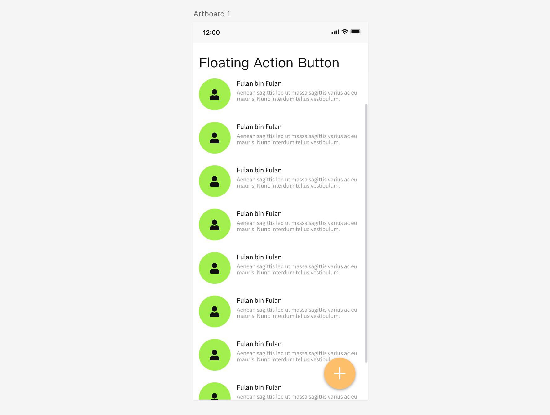
Let's outline our application goal. We aim to construct an interface displaying a scrolling list of dummy contacts or emails. Overlaid on this list, persistently anchored to the bottom-right coordinate, will be our FAB featuring an unmistakable plus (+) icon intended for adding a new entry.
Creating the Base List
Before we introduce our floating button, we must establish the background scrollable content. We'll utilize a simple `ForEach` loop trapped within a standard SwiftUI `List` to generate thirty rows of repetitive dummy data.
import SwiftUI

struct ContentView: View {
    var body: some View {
        List {
            ForEach(1 ... 30, id: \.self) { _ in
                HStack(spacing: 15) {
                    Image(systemName: "person.fill")
                        .padding(10)
                        .background(.green.opacity(0.3))
                        .clipShape(Circle())

                    VStack(alignment: .leading) {
                        Text("Anonymous User")
                            .font(.headline)
                        Text("Aenean sagittis leo ut massa sagittis varius ac eu mauris. Nunc interdum tellus vestibulum bibendum pulvinar.")
                            .font(.caption)
                            .foregroundColor(.secondary)
                    }
                }
            }
        }
        .navigationTitle("Floating Action Button")
    }
}
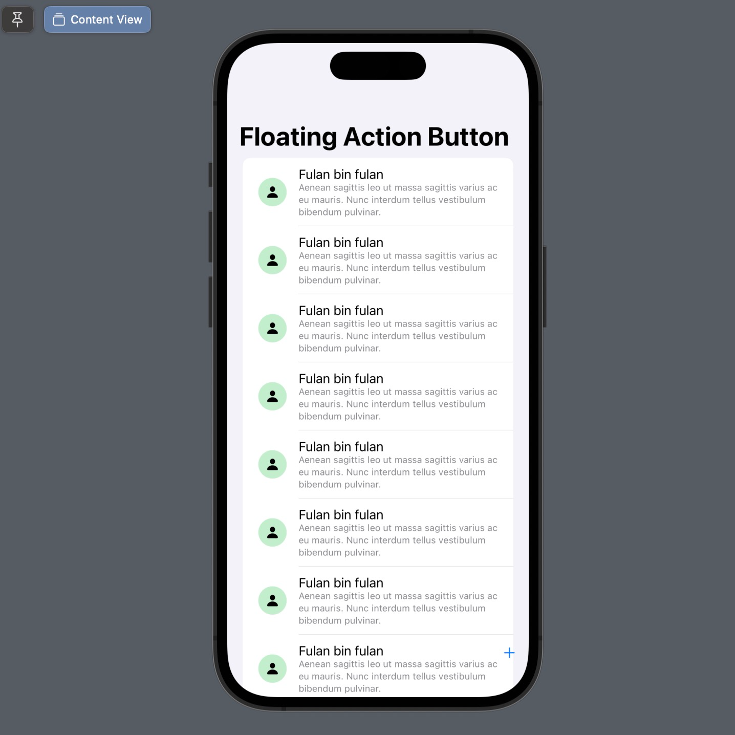
Layering with ZStack
Because the FAB needs to float above the scrolling list without being disturbed by the user's vertical scrolls, we need to wrap the entire `List` inside a `ZStack`. The `ZStack` paints views systematically from back-to-front.
struct ContentView: View {
    var body: some View {
        ZStack(alignment: .bottomTrailing) {
            // Layer 0: Background
            List {
               // ... list items
            }

            // Layer 1: Foreground
            Button {
                print("FAB Clicked!")
            } label: {
                Image(systemName: "plus")
            }
            .padding()
        }
        .navigationTitle("Floating Action Button")
    }
}
By default, any unconfigured `ZStack` drops all contained elements smack in the geometric center. That is why modifying the stack initialization to ZStack(alignment: .bottomTrailing) is crucially important. This forces the localized anchoring of overlaid layers straight into the bottom-right bounds of the device safe area.
Styling the FAB
The generic blue system button isn't a proper FAB until it's circular, clearly colored, and visibly elevated from the background content. We accomplish this by stringing together a sequence of modifiers to the `Image` block inside our `Button` label, and finishing it with a critical .shadow() effect to simulate depth.
Button {
    // Action triggered on tap
} label: {
    Image(systemName: "plus")
        .font(.title2.weight(.bold))
        .foregroundColor(.white)
        .padding(20)
        .background(Color.orange)
        .clipShape(Circle())
        .shadow(color: .black.opacity(0.3), radius: 5, x: 0, y: 3)
}
.padding(.trailing, 20)
.padding(.bottom, 20)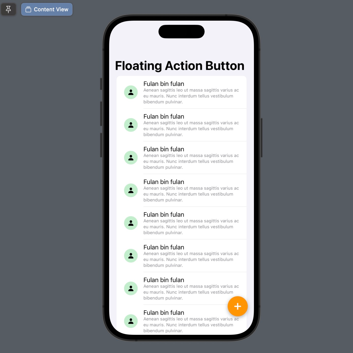
Extracting for Reusability
If you plan to use this FAB design across multiple screens in a big production app, cramming the configuration directly inside the `ZStack` violates DRY (Don't Repeat Yourself) principles. A highly recommended best practice is to extract it into its own abstracted View struct:
struct FloatingActionButton: View {
    var iconName: String
    var action: () -> Void

    var body: some View {
        Button(action: action) {
            Image(systemName: iconName)
                .font(.title2.weight(.bold))
                .foregroundColor(.white)
                .padding(20)
                .background(Color.orange)
                .clipShape(Circle())
                .shadow(color: .black.opacity(0.3), radius: 5, x: 0, y: 3)
        }
        .padding()
    }
}

// Usage in parent View:
// FloatingActionButton(iconName: "plus") { print("Tapped") }
With this abstraction, you have successfully created a modular and pristine Floating Action Button using Swift's native declarative layouts. The result accurately mirrors the iconic Material Design aesthetics.
 meshwara