Fixing the issue of an unclickable SwiftUI Plain Button when tapping on the empty area
This article discusses how to address the issue of Plain Buttons in SwiftUI that cannot be clicked in the empty areas

If you're using a Button widget in SwiftUI, by default, the entire label of the Button is clickable. This is the default tap area for the Button if you use a button style other than Plain. For example:
struct ContentView: View {
    @State private var show = false
    var body: some View {
        Button {
            show.toggle()
        } label: {
            HStack {
                Image(systemName: "plus")
                Text("Add data")
            }
            .padding()
            .frame(maxWidth: .infinity)
        }
        .background {
            RoundedRectangle(cornerRadius: 10.0)
                .stroke(.primary, lineWidth: 0.2)
        }
        .padding()
        .sheet(isPresented: $show){
            Text("Pop Window")
        }
    }
}
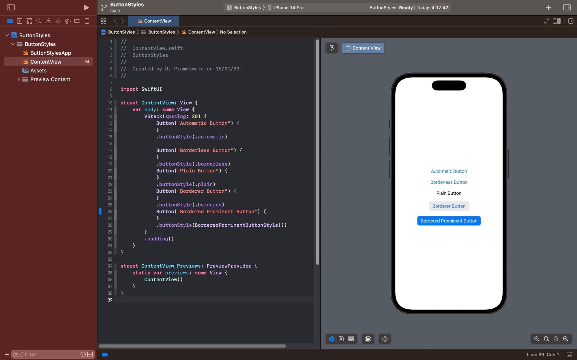
The example above is a Button that contains an icon and text, with border modifier to make it appear as an outlined Button. As mentioned in the article : 5 ButtonStyles di SwiftUI, the default style for this button is automatic.
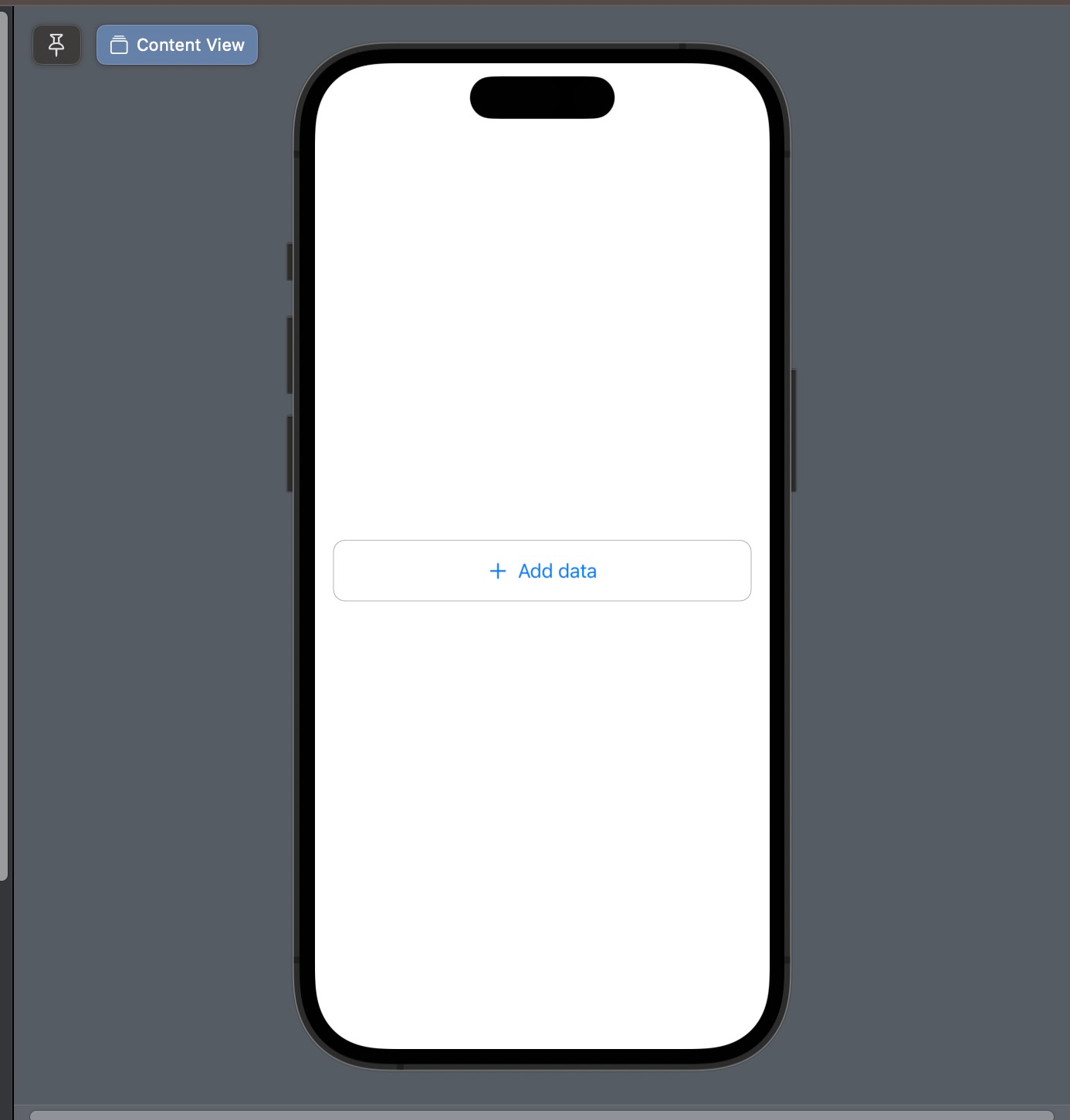
And as you can notice, you can click on all parts of the button. Even in the areas that appear empty.
However, styles like this are sometimes not what you want, because all parts inside the button will appear as a hyperlink or be colored in blue. Therefore, the button style is usually changed to .plain, which makes the color of content inside the button become default, and than allows you to customize it as needed.
struct ContentView: View {
    @State private var show = false
    var body: some View {
        Button {
            show.toggle()
        } label: {
            HStack {
                Image(systemName: "plus")
                Text("Add data")
            }
            .padding()
            .frame(maxWidth: .infinity)
        }
        .buttonStyle(.plain)
        .background {
            RoundedRectangle(cornerRadius: 10.0)
                .stroke(.primary, lineWidth: 0.2)
        }
        .padding()
        .sheet(isPresented: $show){
            Text("Pop Window")
        }
    }
}
However, this style has a side effect, which is make not all parts of the button can be clicked. Only the parts containing text or an image can be clicked. This is why the empty parts of a plain button cannot be clicked.
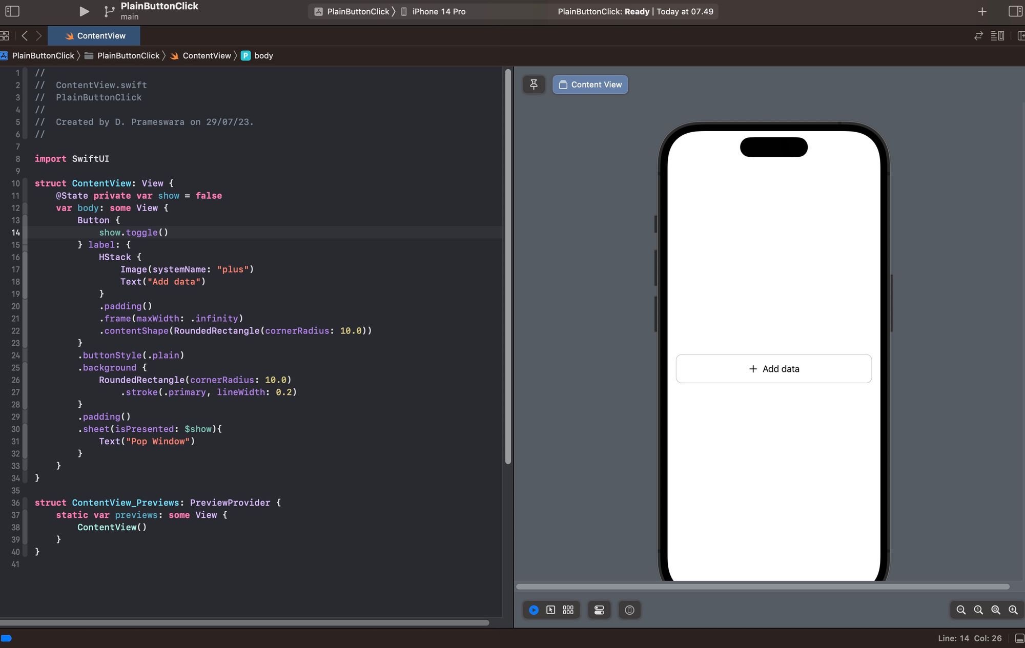
To fix this issue, it's actually quite simple. Just add the .contentShape modifier within the Button's content. Remember, it should be inside the Button's content, not the Button it self.
func contentShape<S>(
    _ shape: S,
    eoFill: Bool = false
) -> some
So, the code can be modified as follows.
struct ContentView: View {
    @State private var show = false
    var body: some View {
        Button {
            show.toggle()
        } label: {
            HStack {
                Image(systemName: "plus")
                Text("Add data")
            }
            .padding()
            .frame(maxWidth: .infinity)
            .contentShape(RoundedRectangle(cornerRadius: 10.0))
        }
        .buttonStyle(.plain)
        .background {
            RoundedRectangle(cornerRadius: 10.0)
                .stroke(.primary, lineWidth: 0.2)
        }
        .padding()
        .sheet(isPresented: $show){
            Text("Pop Window")
        }
    }
}
With this modification, all parts of a button with the .plain style now will be clickable.
The .contentShape modifier is very useful in situations like above, or in other cases, such as when you want to add buttons inside List items.
Happy experimenting, and I hope this little tip is helpful.
 meshwara